

Commodities Update - Week In Review And The Week Ahead – Part 13
Commodities Update - Week In Review And The Week Ahead – Part 13
Excelsior Prosperity w/ Shad Marquitz - (06/24/2024)

The latter half of last week I was thankfully out of town traveling on the west coast of Washington; camping, hiking, and visiting some beautiful beaches. It was fantastic to unplug from the glowing screens and markets for a few days and just recharge in nature. Upon returning on Sunday, I decided to pull up the charts to see how things shaped up in the commodities sector. On the weekly charts the trends were less clear. However, upon shifting down to the daily charts, there was a much more compelling relationship between prices on multiple commodities, ETFs, and individual stocks, and the 50-day Exponential Moving Average (EMA).
Now, I know and respect that some people don’t care for technical analysis, preferring instead when we delve more into the macroeconomic factors moving the markets, or supply/demand fundamentals, or specific company deep dives. However, even if one doesn’t really care for an overall strategy, they can still consider the merit and utility of learning another useful tool for stock analysis. For this commodities review, it seems valuable to isolate one of these such tools for investors of all stripes to at least consider when making acquisitions and adding to positions, or selling and trimming back positions… The 50-day EMA. We’ll apply it now to Gold, GDX, Silver, SILJ, Copper, COPX, Oil, Nat Gas, and then show another possible progression into pricing support on the URNM chart. We’ll keep this one brief, punchy, and to the point.
So, let’s get into it…
There are different strokes for different folks, and a variety of strategies and opinions about how to interpret and utilize technical analysis — so not everybody is going to agree on the “best” way. There are simply lots of “ways,” and there is no best one or single path. For me personally, I don’t have hours and hours to stare at charts, or analyze tons of complicated overlays. I prefer technical strategies that are simple, relevant, and useful; that also give me a quick insight into the current setup and pricing trend. The moving averages are one of these tools to be utilized. They can have a multitude of time periods applied showing the average price over that period and which way it is sloping and trending. The most widely utilized moving averages are the 21, 50, and 200 periods (hour, day, week, month).
When using the 50-day exponential moving average as a lens to view these commodities and resource stocks through, it is important to note where this level offers pullback support, and where it comes in as overhead resistance to cap rallies. Those can be helpful knowing where to buy or sell equities when trading.
It is also instructive to note when pricing decisively breaks through this 50-day EMA, crossing to the upside or downside in breakouts or breakdowns. These can also be helpful signals when targeting when to buy and when to sell. Nothing is perfect. No system is without faults. This is just a good arrow to have in one’s quiver when quickly assessing a stock chart, and it’s in play in the commodities.
Let’s kick things off with a chart of Gold:
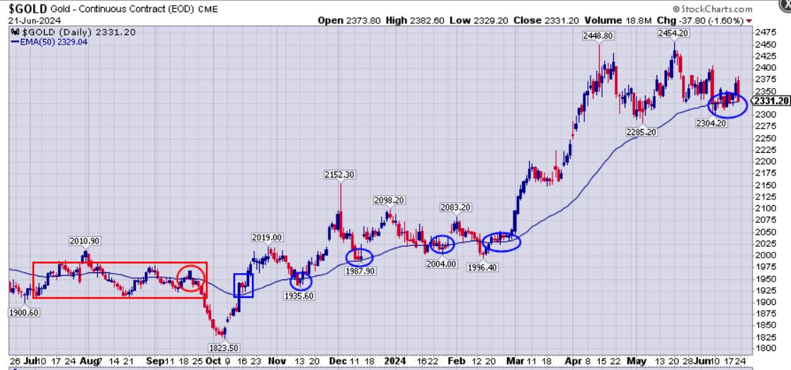
Just a quick glance of gold price in relation to the 50-day EMA shows that last summer pricing was channeling sideways on either side of it [as noted inside the red rectangle]. Then in September it proved to ultimately be resistance in the tug-of-war, and pricing dropped below the channel and fell sharply into the most recent trough in October, down to $1823.50. Gold pricing then made a V-shaped recovery and took out the 50-day EMA later in October. This kicked off a very bullish period for the yellow metal through the present. Since that breakout point last October [blue box], the 50-day EMA has been acting as solid support on consolidation moves, [as noted by the blue ellipses on the chart].
We can see that pricing throughout June has been very congested on either side of the 50-day EMA, and it’s going to break hard one way or the other. If the bullish trend that started last October continues to hold, then the 50-day EMA should be currently offering support before the next blast higher. If pricing breaks substantially lower than this level though, then we should make note that a corrective period could be underway and then adjust accordingly. Based on the past 8 months, we can say that the bulls are still in control, and that this level has been repeatedly offering support. Which way things resolve, coming out of this consolidation around the 50-day EMA, is definitely something to keep an eye on.
Let’s look at the senior gold stocks by way of a daily chart of ETF (GDX):
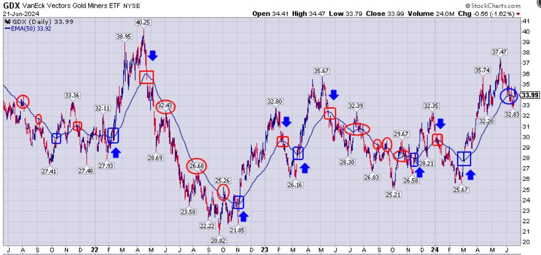
What sticks out to me on this GDX chart, over the last few years, is how the pricing crossing through the 50-day EMA [noted in red or blue boxes] is often an accelerant to that direction (breaking down or breaking out), forming short term trends. Additionally, this level has often been acting as overhead resistance in 2021, 2022, and 2023. Pricing the last 2 weeks has been flirting with the level once again, and has the opportunity to potentially switch to support, which still remains to be seen with some follow-through to the upside. GDX pricing in relation to this level should be monitored very closely, because it could also end up turning into another red box, if pricing sinks too far below the 50-day EMA.
Next is a 1-year daily chart of Silver:
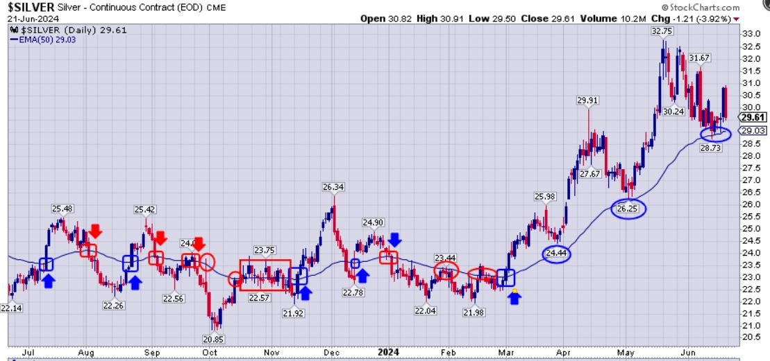
Silver has been more of a whip-saw pricing chart for some time, but one can see the directional cat and mouse game playing out on either side of the 50-day EMA [noting the red and blue rectangles at significant crosses through this level]. Since the consolidation and decisive breakout above this level in early March [noted by blue box], it has acted as support on each consolidation move lower in March, May, and June. Will the 50-day EMA continue to act as support for Silver, or will we see a dramatic slice below it and another trend change? (this is a key question for consideration and to follow along with in the weeks to come.)
Let’s have a look at the silver miners in the ETF (SILJ):
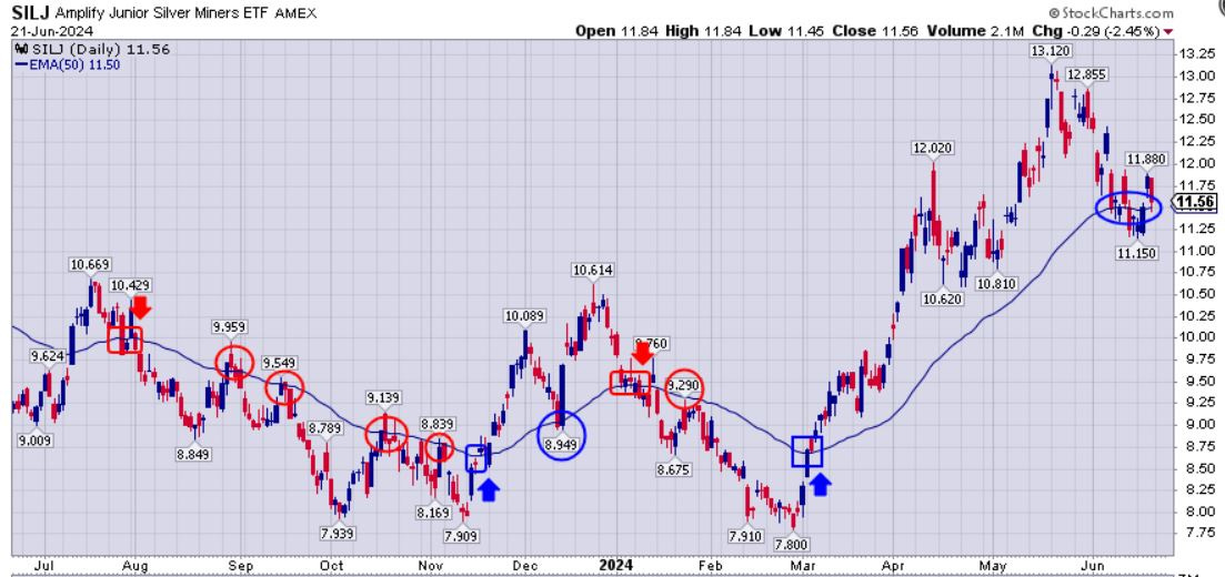
For (SILJ) the 50-day EMA was overhead resistance much of last year up until mid-November, then it briefly switched to support through year-end, but then back again to resistance the first couple of months of this year. However, in March, SILJ decisively broke up through this level and has been in a solid uptrend since then and has been consolidating on either side of the 50-day EMA through most of June. It will be interesting to see if this support holds for the next rally higher (where this would be a good accumulation point), or if it turns into a new red box with a short-term trend change back to the downside (where it would be ideal to reduce exposure in the near-term).
Let’s look at the 1-year Copper chart:
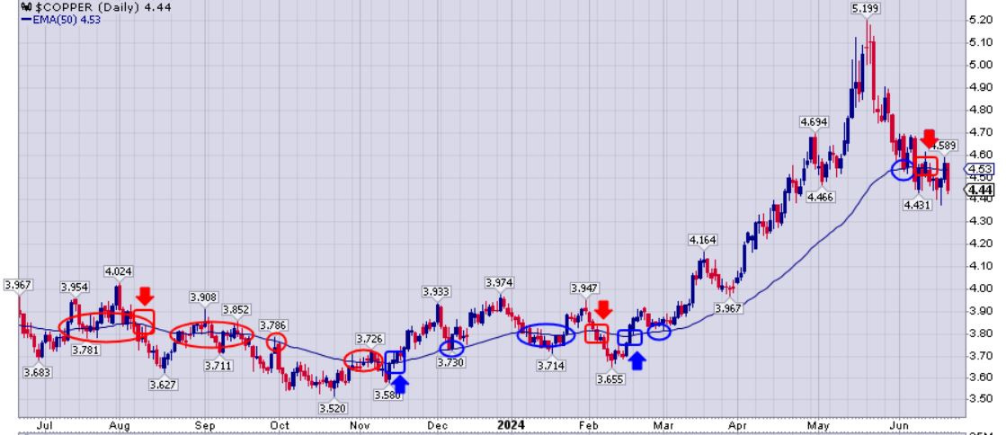
Last summer, after copper prices consolidated around the 50-day EMA, pricing definitively broke below this level [noted by red box and arrow], and it then became overhead resistance. Then the trend changed upward in mid-November [noted by blue box and arrow]. This move then saw the copper price waffling around either side of the 50-day EMA until the decisive break higher in February, where a bullish impulse leg began in the red metal. Prices came down to this level in early June, which looked to be a good place to see this area act as support, and initially it did. However, pricing did break down far enough below his level to switch back to near-term bearish posture and back to acting as overhead resistance.
Will pricing blast back up through it and kick off another bullish uptrend, or will it continue breaking lower accelerating the downtrend?
We are at an interesting inflection point here for copper in June, just like most of the metals and ETFs we’ve looked at thus far. It’s almost uncanny how many commodities and resource stock price charts are all sitting right at their 50 day EMAs.
Let’s look at how the senior copper miners are doing by way of the ETF (COPX):
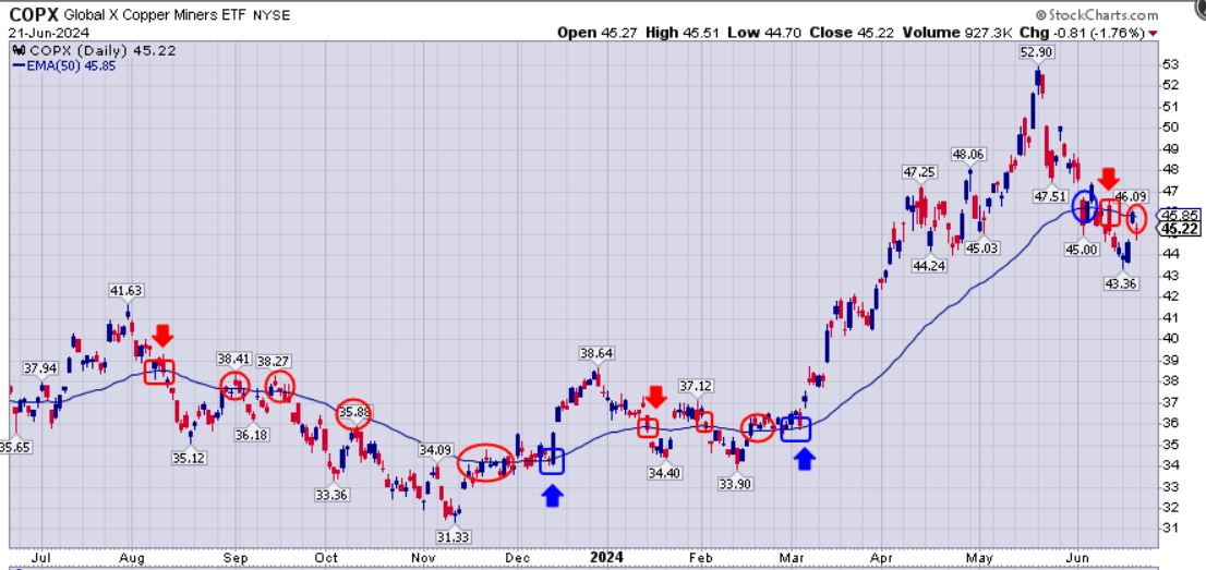
COPX was capped by the 50-day EMA from last August – November, and then in December finally caught up to the trend change seen in copper and had a nice year-end pop into early this January. Then it was under pressure later in January through February. Then in early March, COPX decisively broke up away from the 50-day EMA and started a new bullish impulse leg to make new all-time highs by mid May up to $52.90. That ended up a being the high-water mark in COPX and coincided with a new all-time high in copper up to $5.20 per pound. In early June the 50-day EMA offered pricing support for the bounce, but then pricing broke down into a bearish posture, like copper, and now this level is acting as near-term resistance, but pricing is right back to either side of this level, and it is key to watch which way this resolves.
Now let’s look at WTI Oil on the 1-year daily chart:
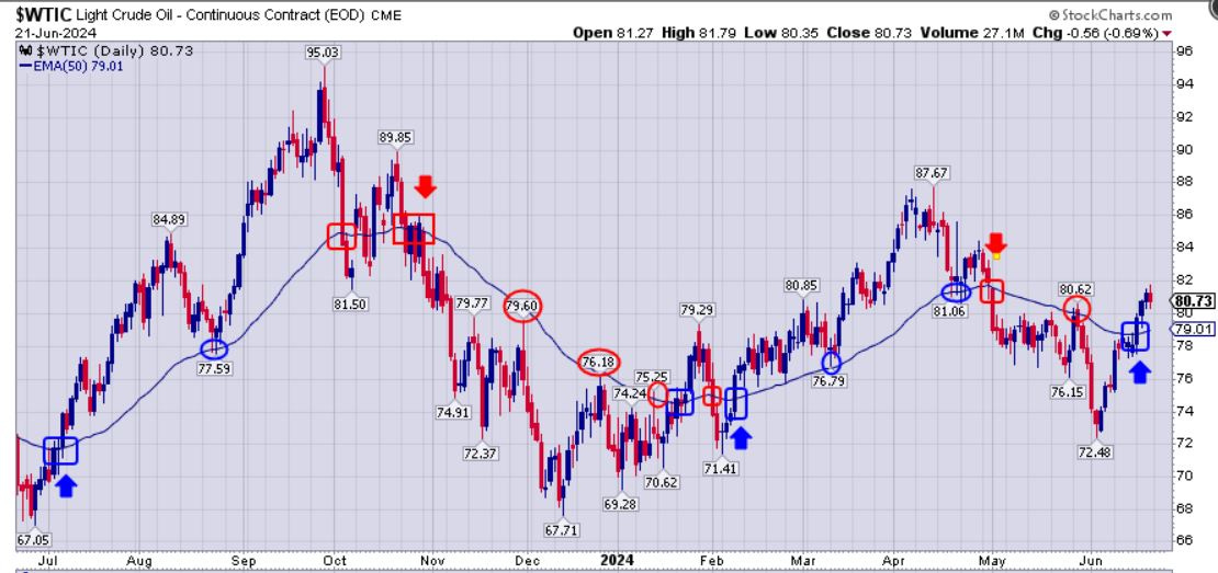
Oil prices broke out decisively above the 50-day EMA last summer in July [noted by blue box and arrow], and it acted as support in August. However, then the trend changed to bearish in October [noted by red boxes and arrow], and this level acted as overhead resistance in late November and late December into January of this year. Then in late January there was a tug-of-war between the bulls and bears, and then a decisive blast higher above the 50-day EMA in February, where this level switched to acting as support in March and April. May saw another reversal of fortunes for the oil price, and switched to another corrective leg before bottoming in early June. Just recently oil broke back up above this level in a meaningful way, and it will be interesting to see if there is some legs to this recent break higher.
Now let’s review the 1-year chart for Nat Gas:
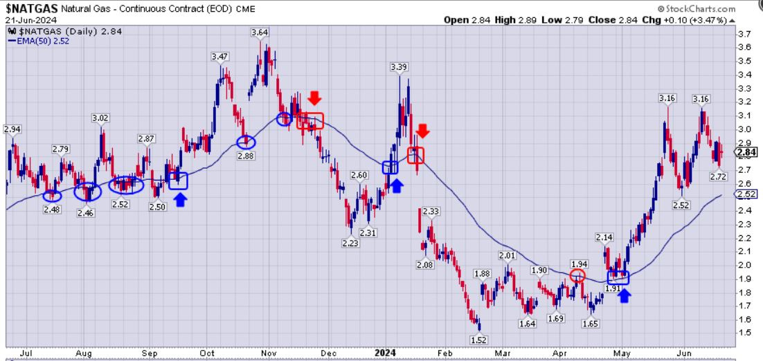
Nat Gas saw the 50-day EMA acting as support from last summer in July though Autumn in October and early November, before reversing the trend in mid-November back to a bearish corrective move through year-end. Then in early January, natural gas blasted higher but quickly reversed right back down the other side of the parabola and definitively broke support at the 50-day EMA into a protracted correction all the way through May of this year. Then when pricing took off far above this level in early May it started a new a new bullish impulse leg back higher again, and is still well above pricing support. We’ll look to see how nat gas pricing responds when it inevitably tests the 50-day EMA support.
So we can see that when filtering these pricing charts to view them in concert with just the 50-day EMA that it can be a valuable tool in looking for breakouts or breakdowns, and also within those trends to anticipate areas of support or resistance for swing-trading or position-trading.
The point should be made that there are other key moving averages like the 21 day/week or 200 day/week and plenty of other lessor followed moving average time periods we could look at for further support/resistance areas. Personally, I like using the 144 day EMA as a Fibonacci number for next support, and it is only slightly different than the more popular 21 week EMA (that would be 147 days and very close to the 144 days). Then below that level is the widely-followed 200 day EMA.
Let’s look at the Sprott Funds Uranium Mining ETF (URNM) an example of where the 50-day EMA was in play like a magnet for a long time, but then gave way to the 144-day EMA as next support several times.
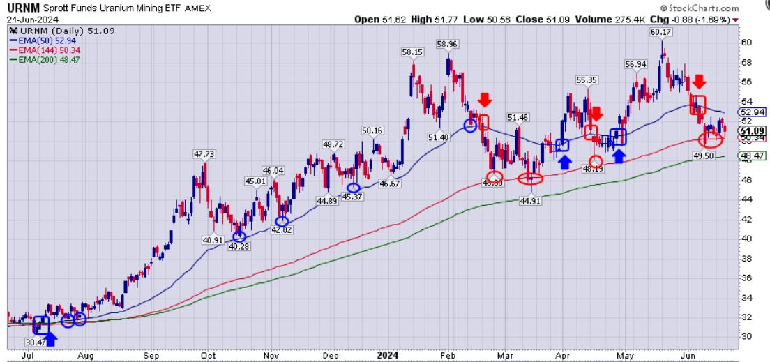
URNM broke out above the 50-day EMA last summer in July, and then came back and tested it for support in October, November, December, and nearly so in early January. However, in February when testing this level as support, it did bounce but then shortly thereafter yielded to the downside getting down near the 144-day EMA area. In March the 50-day EMA was tested as overhead resistance, and reversed back down to test the 144-day EMA gain, then a whip-saw market on either side of the 50-day EMA, but then back down in April to test the 144-day EMA again. Then in late April URNM pricing finally broke decisively above the 50-day EMA again to start another bullish rally through May, but then broke down below this support again in early June to retest the 144-day EMA, yet again… There are clearly a number of examples of where the 50-day was in play for a number of moves, but when broken, the 144-day acted as solid pricing support. We’ve not seen the 200-day EMA come into play yet, but it is there as the green line for reference. Also, the cup & handle pattern in the uranium stocks is still a bullish pattern that could indicate an upcoming directional trend back higher again, that we’ll continue to closely monitor.
This is a good case study and example of how to use multiple layers of moving average support for position trading, and for adding or trimming existing positions. Again, this is just another tool one can look to for increasing the probabilities of a trade in their favor, but it is not fool proof, and there are times where it looks like a new trend is underway, and it gets quickly reversed. Still, there are more times than not, when looking at the 50-day EMA can be a useful signal for trend and pricing direction or reversals, and this level is definitely clearly on display in many of the commodity and related resource stock ETFS that we reviewed in this article.
We’ll get back into some fundamental company information and supply/demand fundamentals in some upcoming articles, and give the technical side a rest, but hopefully readers here found value in analyzing these charts using this tool of the 50-day EMA, and can use it their own trading down the road.
Thanks for reading and may you have prosperity in your trading and in life.
- Shad